
Amazon Connect real-time metrics: built-in dashboards vs a wallboard
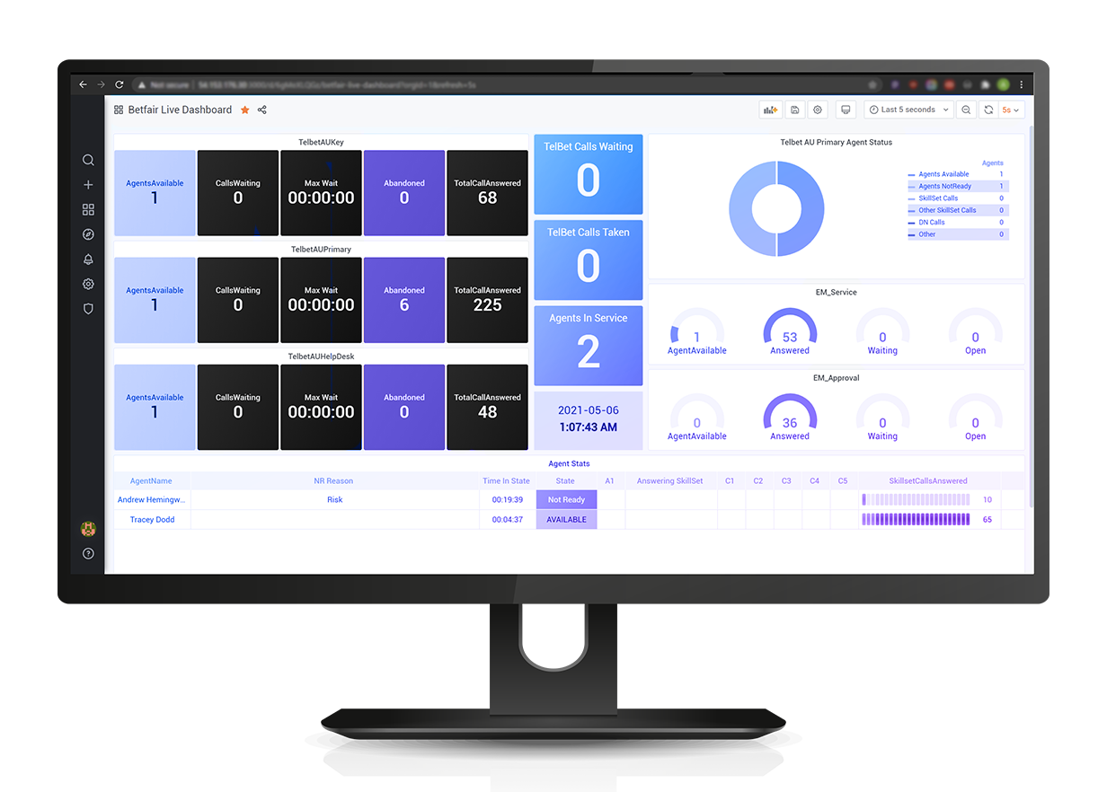
The built-in dashboards are better than people think — and still not a wallboard. They are also a supervisor tool, not a floor tool — and the difference is not features, it's who the screen is for. This is a practical account of what the native page does, where it runs out, and what actually changes when the numbers go on a wall.
What the native real-time metrics page does
Inside the Amazon Connect admin website there is a real-time metrics page that reports on queues, routing profiles and agents. You choose which of the three tables to view, pick the columns you care about, filter to the queues or routing profiles that matter to you, and save the arrangement as a report you can come back to. It refreshes itself continuously while the tab is open.
The data behind it is the data that matters: how many agents are online, available, on a contact or in after-call work; how many contacts are waiting; how long the oldest one has been waiting; how the queue is tracking against service level; how many have been handled and abandoned so far. Agent-level views show current status and time in that status, which is what most team leaders open first thing in the morning.
There is also a programmatic route. Amazon Connect exposes current-metric and metric-data APIs, and agent and contact event streams, so the same underlying numbers can be pulled into something you build yourself. That option matters later in this article, because every third-party dashboard for Connect is ultimately drinking from those same taps.
For one supervisor with one instance and one browser tab, this is often all you need. Do not buy anything until you have actually used it.
What it can't do
The native page is designed as an authenticated, per-user, in-browser view of one Amazon Connect instance. Every limitation follows from that sentence.
- It isn't a display. Putting it on a wall-mounted screen means a machine signed in as a real user, holding a session open, on a page laid out for a desk monitor at reading distance. Sessions expire, screens sleep, someone's credentials end up on a TV in a room with visitors in it.
- There are no thresholds. A number that has gone bad looks exactly like a number that is fine. On a wallboard the entire point is that a person twelve metres away, not looking directly at it, notices the colour change before they notice the number.
- There is no alerting. Nothing emails, messages or escalates when the oldest contact crosses ninety seconds. Someone has to be watching, and the moments when nobody is watching are precisely the moments that hurt.
- There is no floor map. Tables tell you three agents are in after-call work. They don't tell you which three, sitting where, and whether they are the three next to the new starter who needs help.
- It shows Amazon Connect only. Nothing else. Not the CRM backlog, not the outage board, not the other contact centre platform half your business runs on.
- It doesn't rotate or publish. No playlists cycling through views for different teams, and no public view you could put in front of customers.
None of that is a criticism of Amazon Connect. It's a well-scoped operational page doing its job. It just isn't the job a floor screen does.
What supervisors actually watch
Watch a contact centre floor for an hour and the pattern is consistent. Almost nobody reads the whole table. They watch three or four numbers, and they watch them for a change, not a value.
Typically: oldest contact waiting — the single best early warning there is; contacts in queue against available agents; service level so far today, because that's what gets reported upward; and agents in a non-productive state, because that's the lever a team leader can actually pull in the next sixty seconds.
Two design consequences fall out of that. First, a wallboard should carry fewer metrics than a report, in much larger type, with colour doing the work. Second, the metrics that belong on the wall are the ones a person on the floor can act on this minute. Average handle time month-to-date belongs in a report; it belongs on a wall only if you want people to ignore the wall.
The third thing people watch is not a contact centre metric at all. It's whether the floor is winning — team targets, callbacks cleared, a leaderboard, the number of five-star reviews this week. Engagement is a legitimate reason for a wallboard to exist, and the native metrics page has no concept of it because it isn't supposed to.
Multi-platform floors
This is the constraint that decides the question for a lot of Australian organisations, and it rarely appears in the requirements document.
Very few contact centres run exactly one platform. A company acquires another and inherits Genesys. The service desk was on Avaya and nobody has funded the migration. A division bought NICE CXone directly. Meanwhile the new customer-service team is on Amazon Connect. Each platform has its own perfectly good native real-time view, and the operations manager responsible for all of them has four browser tabs and no single number for "how are we going today".
LiveUCX exists mainly for that problem. It reads real-time data from Amazon Connect, NICE CXone, Genesys, Avaya, RingCentral and Zoom, and puts them on the same board with the same thresholds and the same definitions — which also forces a healthy argument about whether "service level" means the same thing on each platform. It usually doesn't, and finding out is worth the exercise on its own.
It also blends non-ACD data. Queue depth next to open cases from SQL Server, PostgreSQL or Azure Monitor is a more truthful picture of a bad morning than either source alone.
What a wallboard adds, concretely
Stripped of marketing, a real wallboard product is buying you five things the native page doesn't attempt:
- Unattended display. Screens that run for months without a person signed in, rotating through playlists, including public dashboards you could point at a waiting room to advertise current queue times.
- Thresholds and alerting. Colour rules on any metric, and alerts out to email, SMS, Teams, Slack, webhooks — or a physical light on the wall — when a threshold breaks. Fifteen alert channels sounds like overkill until the one that reaches your on-call manager at 4pm on a Friday is the fifteenth.
- Visualisation beyond tables. Gauges, heat maps, graphs and custom calculations such as a live SLA figure computed the way your business defines it rather than the way the platform does.
- Floor-plan mapping. Agent status laid over an actual seating plan, with time-in-state and reasons, so a team leader walks to the right desk.
- Reach. The same dashboards on a supervisor's laptop and an executive's phone, updating only while on screen so it doesn't drain a battery.
If none of those five appear in your requirements, you don't need a wallboard yet, and any vendor telling you otherwise is selling.
Getting a wallboard live
The sequence that works is unglamorous.
Agree definitions first. Before anyone builds a screen, write down what service level, handled, abandoned and available mean in your organisation, and reconcile that against what each platform actually reports. Most wallboard projects that "lose credibility with the floor" lost it here, not in the tooling.
Start with one screen and four metrics. Resist the pilot that renders every metric available. Add the fifth only when someone asks for it twice.
Set thresholds from your own history, not from a template. Amber and red should reflect the point at which your team can still recover, which you can read out of your own historical reports.
Decide who gets alerted and what they are expected to do. An alert with no owner and no action becomes noise within a fortnight, and a muted alert is worse than no alert.
Then extend to the other platforms and to mobile. Once the floor trusts one board, the rest is configuration.
Commercially, LiveUCX is listed on AWS Marketplace, so it can be subscribed against your existing AWS account; direct plans start at US$180 a month and are set out on the pricing page. If you also run Amazon Connect with an AI agent taking first contact, note that AI-handled contacts appear in the same real-time data as human-handled ones — worth designing your board around before you deploy one, and something we touch on in what an Amazon Connect AI voice agent actually costs.
The short version
Use the native Amazon Connect real-time metrics page for supervision at a desk; it's free, it's accurate and it's already there. Buy a wallboard when the numbers need to be visible without anyone signing in, coloured so a change is noticed across a room, alerting when nobody is looking, or covering more than one platform. That's the whole test — it isn't about which product has more metrics.
Put your queues on a screen the floor watches
See what LiveUCX displays, or subscribe against the AWS account you already have.

Forwarding a queued call to a mobile number quietly drops routing, recording, metrics and the contact record. Why a real softphone on the agent's iPhone keeps every call inside Amazon Connect.
All three cover the enterprise CRMs and all three leave the mid-market to connectors. Native coverage, the five cost lines, migration friction, and what to do if the CRM is Dynamics, HubSpot or Pipedrive.
Link, embed, CTI or full workspace — four products at four prices. What screen-pop really requires, how logging differs per CRM, and the eight questions to ask before signing.